Paula Martinho · Digital Designer
Special Project
IPS Website Design Makeover
Client
IPS_Innovative Prison Systems
Tools
Figma · WordPress · Adobe Suite
My role: UX/UI Designer working independently, leading the project end-to-end, from research through to implementation.Responsibility: Conception of the content structure and visual design of the new website and implementation in WordPress, as part of Special Projects, under direct supervision of the CEO.
Challenge
How to transform IPS's website into an informative, engaging and visually consistent digital hub that clearly communicates the organisation's positioning as a reference in the sector?
Solution
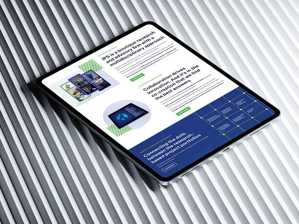
Development of an informative, scalable, user-oriented website, designed to evolve alongside the organisation's growth.The new platform:
Strengthens IPS's digital presence;
Significantly improves the user experience;
Positions the organisation as an innovative, leading consultancy in the sector.
Key results
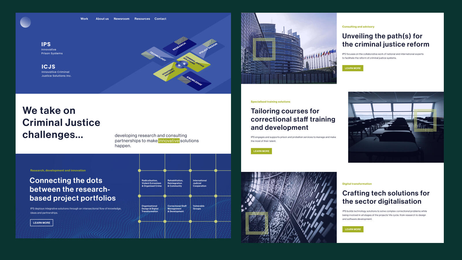
1. Improved user engagement
Simplified navigation and a responsive experience.2. Scalable design system
Modular structure ready for growth and continuous content updates.3. Strengthened brand identity
Consistent visual interface aligned with IPS's strategic positioning.
Approach
The project was guided by the Design Thinking model, enabling continuous validation of problems and solutions. The five phases — Empathise, Define, Ideate, Prototype, and Test — structured an iterative process based on experimentation and rapid prototyping, ensuring informed decisions throughout the redesign.Website audit
Several critical issues were identified:
- High loading times;
- Inconsistent navigation;
- Poorly optimised content.Benchmarking
Analysis of competitors and web design and development best practices:
- Identification of trends;
- Analysis of sector-specific requirements;
- Definition of differentiation opportunities.Stakeholder interviews
Through interviews and research, needs, goals and constraints were identified:
- Improve the user experience;
- Restructure the content strategy;
- Update the visual design.
Empathize
Understanding the user
Persona
Before starting the design process, it was essential to understand the context of the primary user: Sarah Thompson, a public policy consultant. Defining the persona helped direct the project towards a user-centred approach.Needs
- Quick access to relevant information;
- Browse projects and resources;
- Get in touch with experts.Pain points
- Complex navigation;
- Difficulty finding information;
- Lack of mobile responsiveness.
Define
Creative brief
Strategic objectives
Improve content readability;
Effectively communicate areas of expertise, projects and partnerships;
Optimise the website for mobile and search engines;
Update visual identity (typography and colours);
Integrate visual storytelling elements.Content strategy: Focus on sharing knowledge, projects and institutional activity.
Brand personality: Innovation, reliability and competence.
Visual identity: Contemporary, technological and institutional.
Communication tone: Scientific, clear, rigorous and professional.
Ideate
Structuring the solution
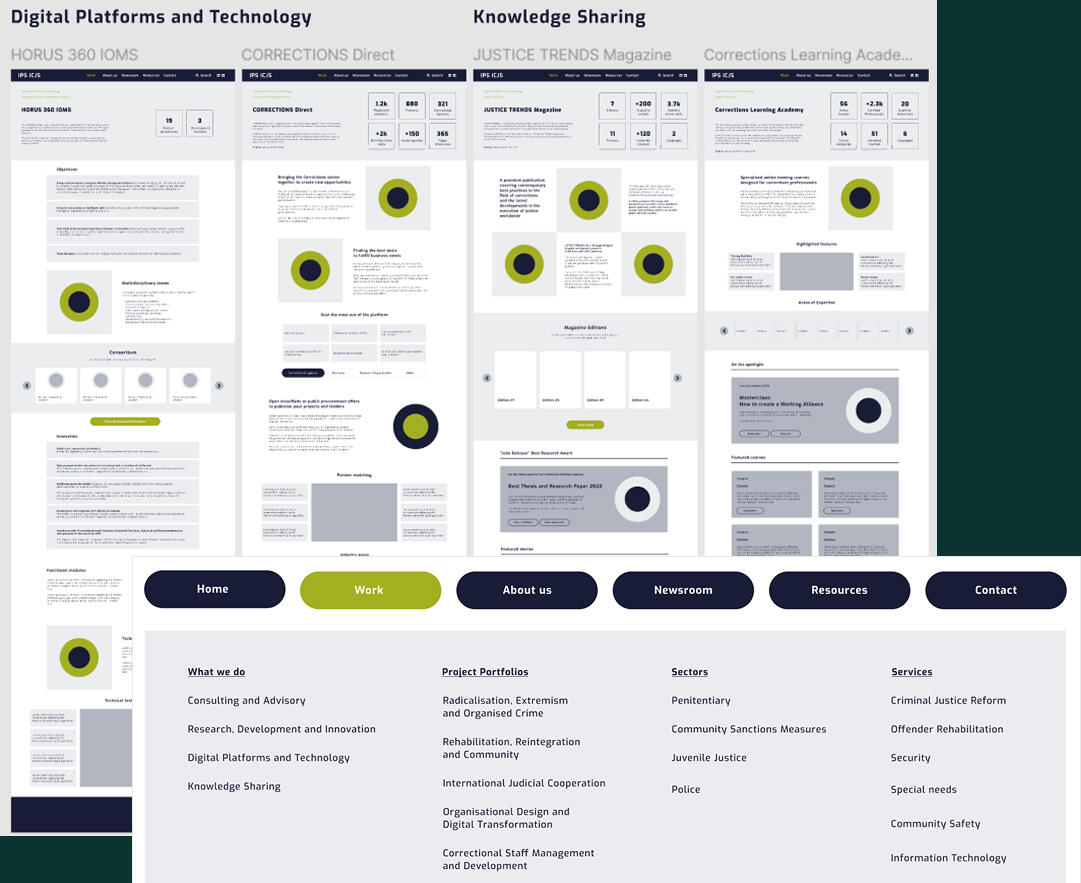
Based on the insights gathered, the focus shifted to organising information.Information architecture
Defining clear hierarchies and content categorisation.Sitemap
Scalable structure balancing simplicity and depth.Wireframes
Low-fidelity representations for rapid stakeholder validation.
Prototype
Bringing the solution to life
Mockups (high-fidelity)
- Structured and informative homepage;
- Resources section optimised for quick reading;
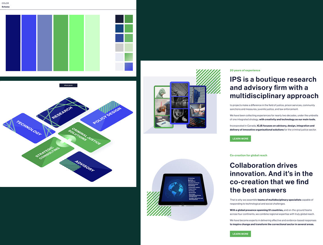
- News section focused on institutional content.Visual identity
A new colour palette proposal featuring blue tones and updated greens (more vibrant).Interactive prototype
Creation of a navigable prototype in Figma to validate the experience before implementation.
Test
Testing and validating
Feedback sessions: Remote sessions are held with stakeholders.Validation: Confirmation of structural clarity and alignment with the organisation's vision.Iteration: Adjustments made based on feedback received. Regarding the new colour suggestion, the blue tones were approved, but the new greens were rejected. The stakeholders decided to keep the traditional "IPS green".
Implement
Developing the website in WordPress
Development: Transition from Figma to WordPress, maintaining fidelity to the tested and validated concept.Scalability: Modular system with reusable components.Optimisation
- SEO;
- Accessibility (WCAG);
- Performance.
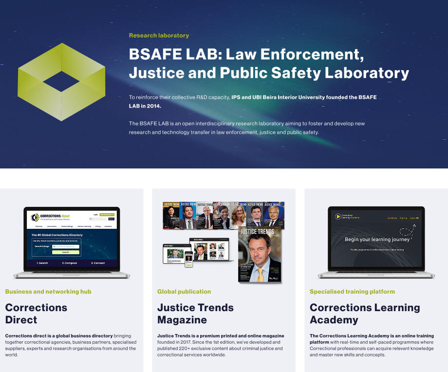
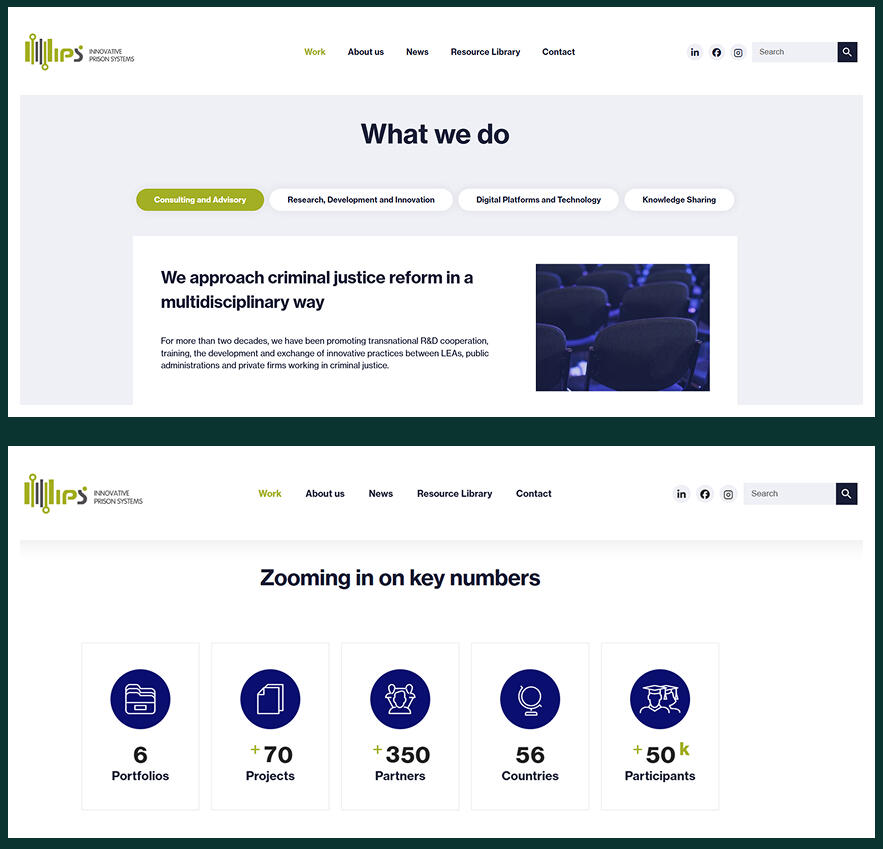
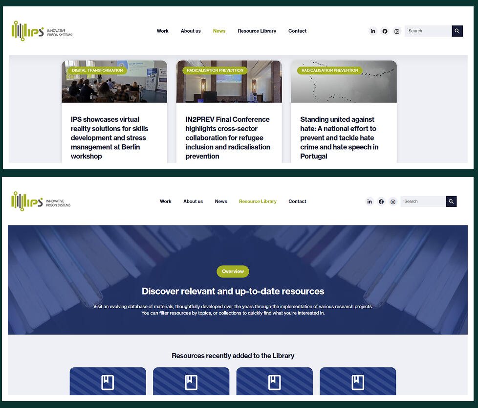
Final result
The website is now:
- Responsive — Adapted to different devices.
- Intuitive — Clear and structured navigation.
- Consistent — Aligned with the brand's identity and positioning.Critical reflection
- The content strategy proved central to the design process.
- Future improvements: Greater involvement of end users in early stages.
- Current status: Live website with potential for continuous evolution.This project demonstrates my ability to:
- Articulate user needs with organisational objectives;
- Apply UX/UI Design methodologies;
- Develop well-grounded digital solutions.
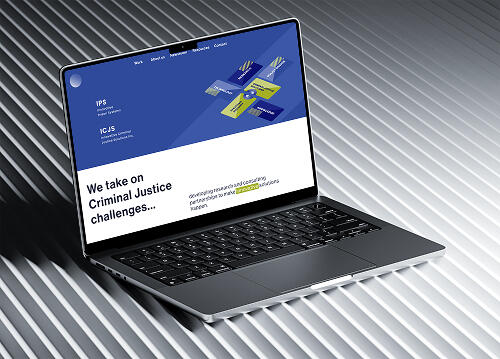
Other projects
Visual Identity Design & Creative Strategy
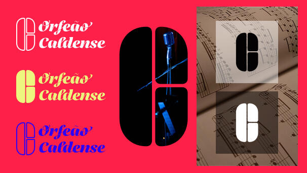
Visual ID Design for Orfeão Caldense
Graphic Design · AI Prototyping · European Project
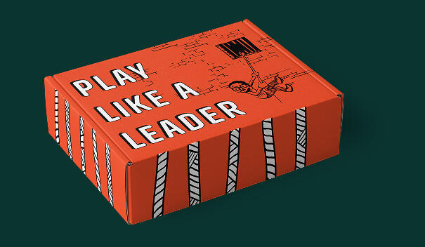
Designing the LEADCOR game: Analogic & digital experiences
Web Design & Development · European Project
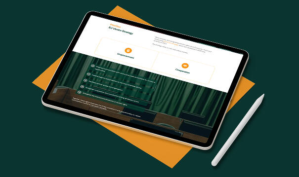
VICTORY Digital Repository
Work in progress. Expect ongoing refinements. A Portfolio is never done-done © 2026 Paula Martinho